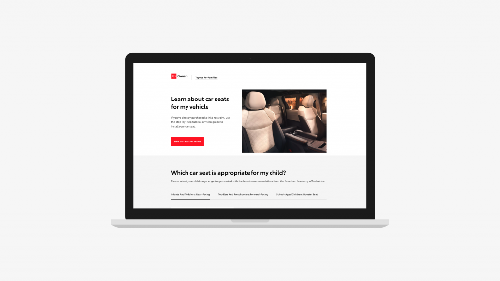
One of the major safety concerns in the industry is that the child car seat is installed incorrectly half the time. So, the higher executives at Toyota started an initiative to promote the education for child car seat installation. Toyota for Families has been a joint effort between Toyota engineers and the Toyota Owners team. It’s the perfect example when a single digital touch point can be so instrumental in improving the in-vehicle safety of our customers.
Visit the live site for Toyota for Families
Role
As the lead UX personnel, I was responsible for auditing the existing printed manual to identify technological dependencies with child car seat configuration. This helped to establish the user flow and navigation. For the pilot, Toyota for Families was available solely for the 2021 Sienna.
Collaborators
Visual Designer
Producer
Business Analyst
Account
Associate Creative Director
Engineers
Copy Writer
Process
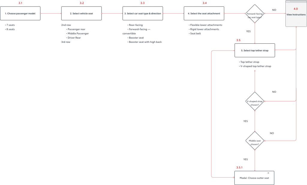
The content partner created video instructions for every single permutation of vehicle seat configuration within the Sienna. The visual design team followed suit in the long arduous effort. Child car seat configuration options include:
- Sienna model — 7 or 8 seats
- Row selection — 2nd or 3rd row
- Vehicle seat — driver-side rear, center, or passenger-side rear
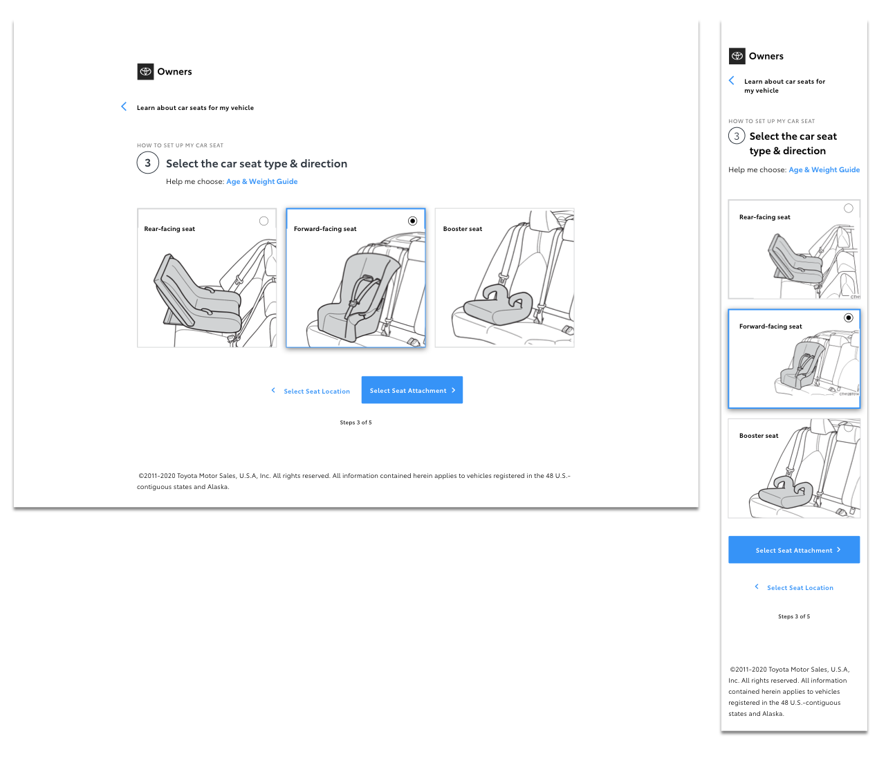
- Car seat type — forward-facing, rear-facing, or booster seat
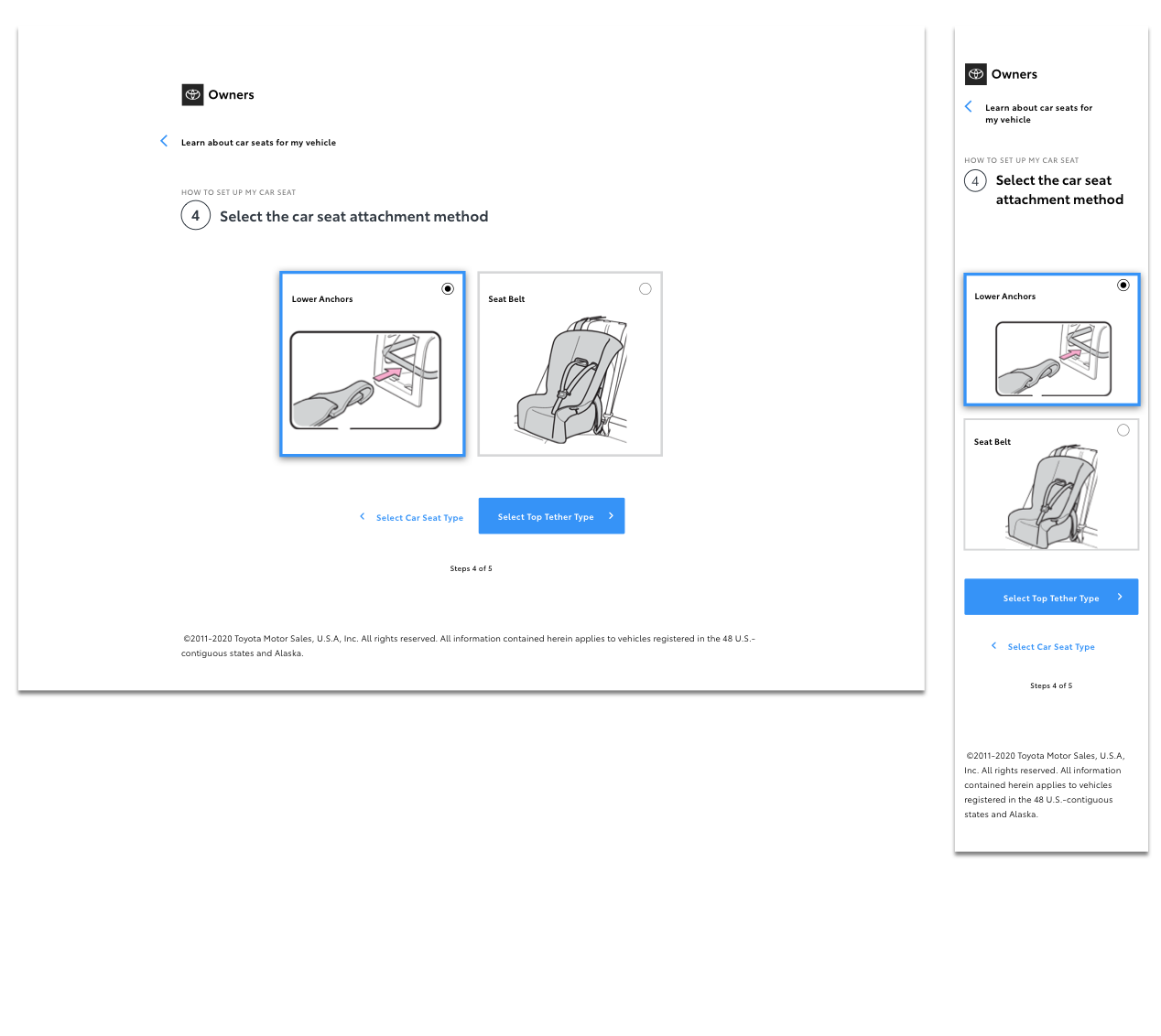
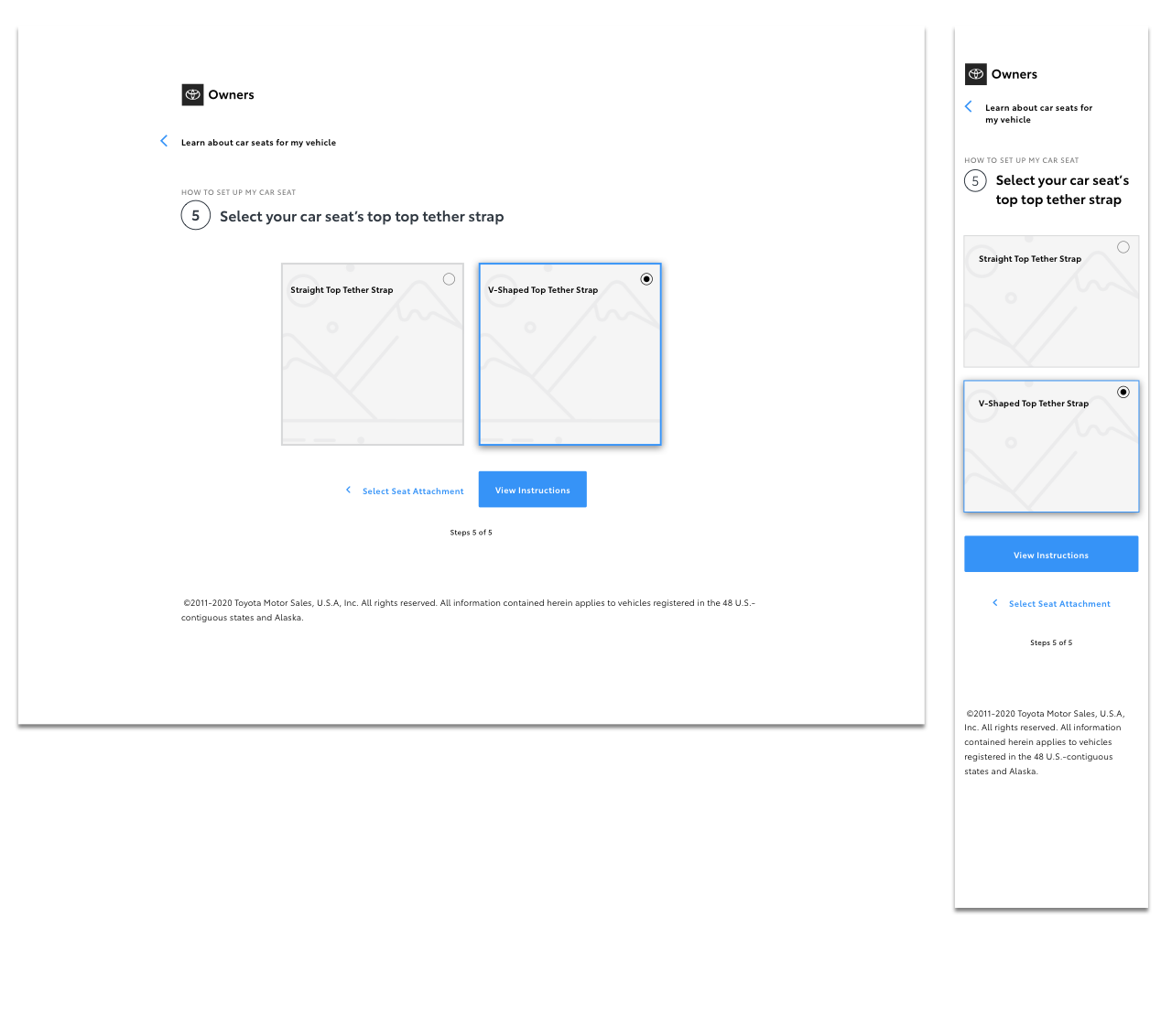
- Attachment type — seat belt or lower anchors
When the visual designer produced assets for the dozens of permutations, there were bound to be errors. As a UX designer, I developed asset naming conventions to ensure that the team stayed organized. I also helped conduct user acceptance testing to identify errors in the assets.
Another challenge was developing the user flow for the vehicle seat configuration. In this process, the user would select their preferences in the steps 1 – 5 above. The process wasn’t so clear-cut as conflicts exist between vehicle seat and child car seat selections. I was tasked with identifying all dependencies and developing mechanisms for error prevention. My solution was to use dialogue modals to resolve conflicts as they arise.
A user flow diagram was a useful tool to delineate all the user paths when conflicts arise and paths of resolution. The flow diagram guided the design for each step.
Wireframes


Visual Design
Summary
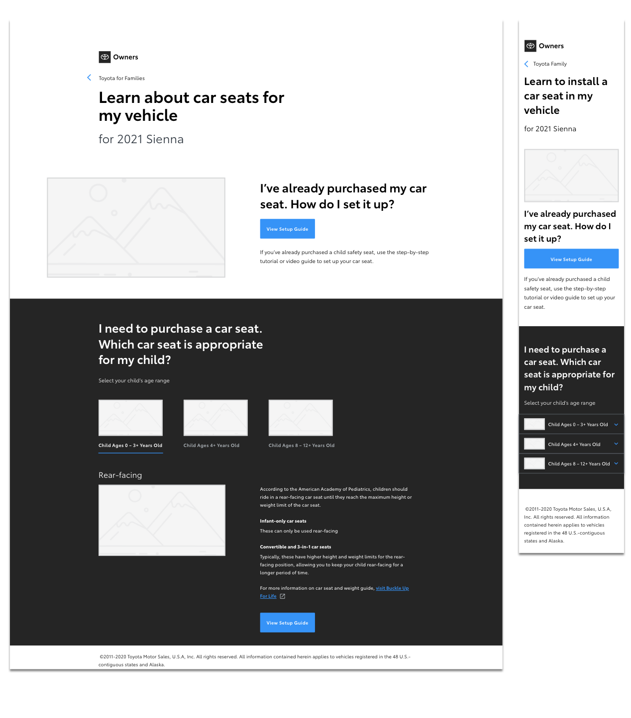
Toyota for Families was designed to be accessible by using our latest typography hierarchy. For the instruction set, the video content above is supplemented with written and static illustrations below. The team also worked to ensure that the foreground and background color contrast ratios were compliant with ADA standards. Moving forward, it was important to the team that a far-reaching brand like Toyota is designed for everyone.
Other collaborators include the Toyota engineers and content partner that wrote more thorough and thoughtful instructions than the printed manual. The project garnered attention from major media sites like CNET and Kelley Blue Book.
The next step is to roll out Toyota for Families to all the latest Toyota models, a major undertaking that will span to the following year. In the mean time, the team has planned user testing to identify and resolve usability issues that may exist in the current solution.