Analytics revealed that the Toyota Owners pages had ineffective masthead designs, resulting in low user engagement. Masthead engagement is important because they help personalize page content. The mastheads also contained background imagery that often conflicted with text legibility. Some masthead controls were non-standard UI elements that resulted in confusion. In order to improve the usability, the design team decided to take a utilitarian stance and focus on common UI conventions. This was an appropriate direction for Toyota Owners, because the platform is primarily used by existing customers as a resource rather than for marketing material.
Role
I collaborated closely with our lead UX designer, strategist, and business analyst to identify UI paradigms that would help achieve project goals. Design jams with whiteboarding were apart of our daily workflow.
Collaborators
UX lead
Strategist
Business analyst
Data analyst
Producer
Account
Visual designer
Project Goals
- Increase user engagement with masthead controls
- Standardize masthead modules with common UI conventions — some mastheads consisted of one-off interactions that could be standardize to match mastheads with similar user tasks
- Re-position Toyota Owners as a utility resource, shifting away the focus from marketing — reduce the use of masthead imagery and introduce task-oriented UI paradigms
Process
Page mastheads were bucketed into different types based on user goals
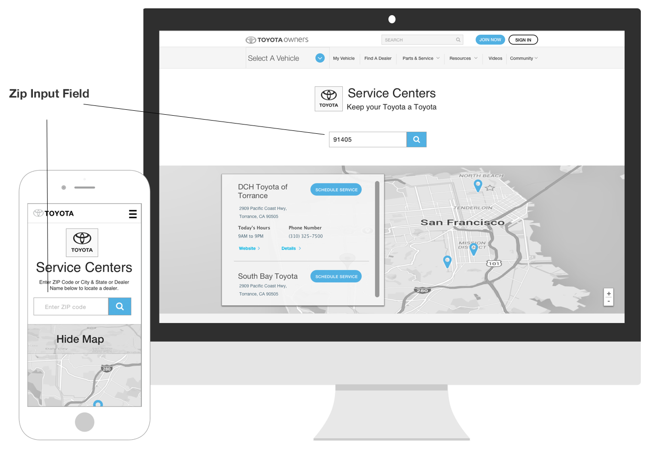
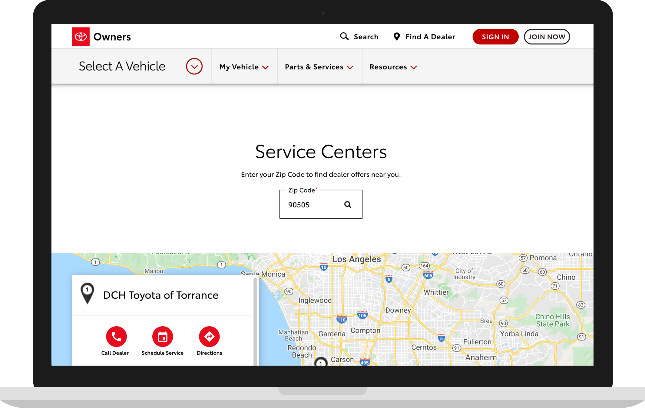
- Zip Input — location-based content
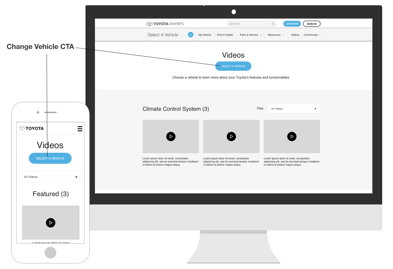
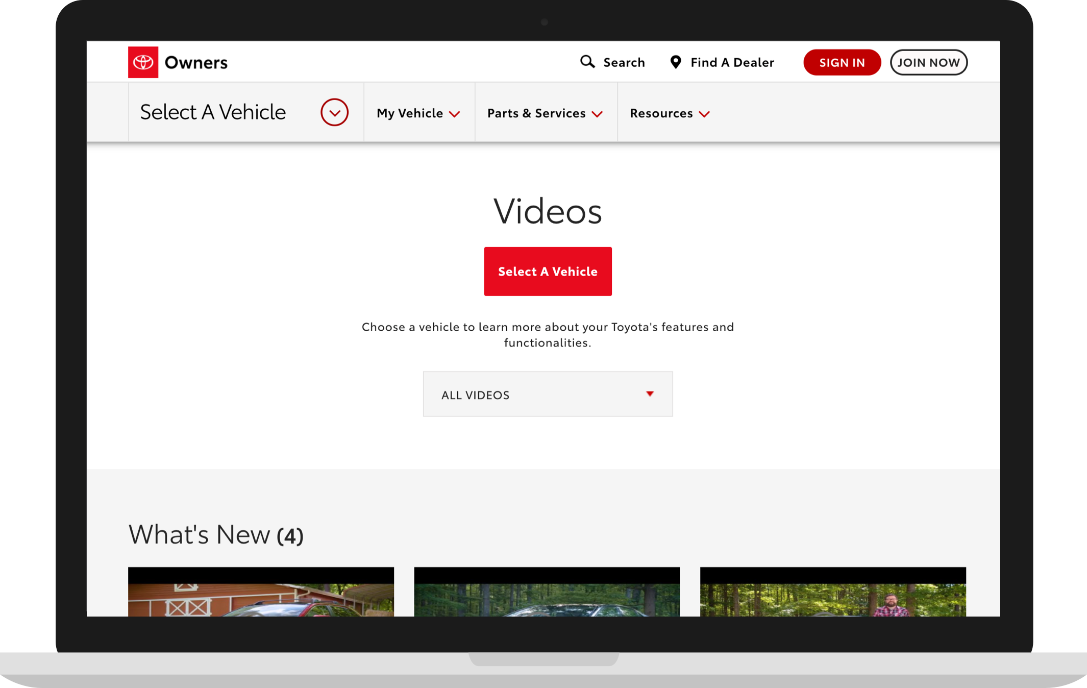
- Select Vehicle — filter content by vehicle model and year
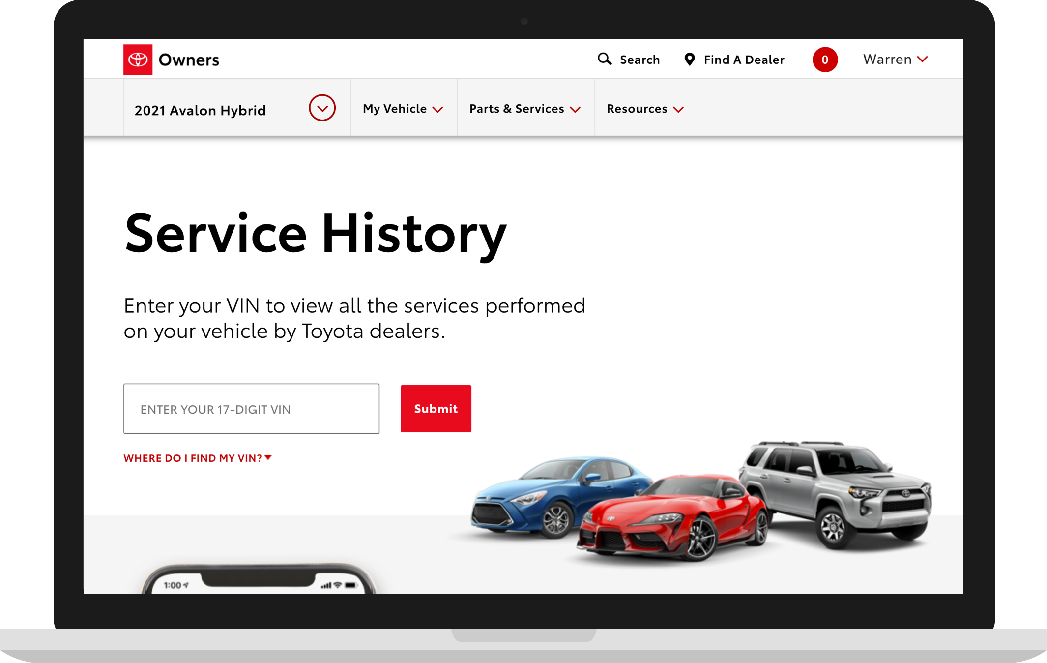
- VIN Input — 17 digit vehicle identification number input field for vehicle-specific content
The team explored the best UI paradigms that are common across the web to increase the ease of use and reduce the learning curve for new users. The team also researched other companies to learn from their UI patterns.
Our design exploration led to the following choices:
• Background imagery was removed to promote text legibility.
• Center masthead content to promote the importance of CTA’s and fields.
• Introduce common nomenclature for button labels, form fields and other naming conventions
• Introduce standardized modules based on the masthead types
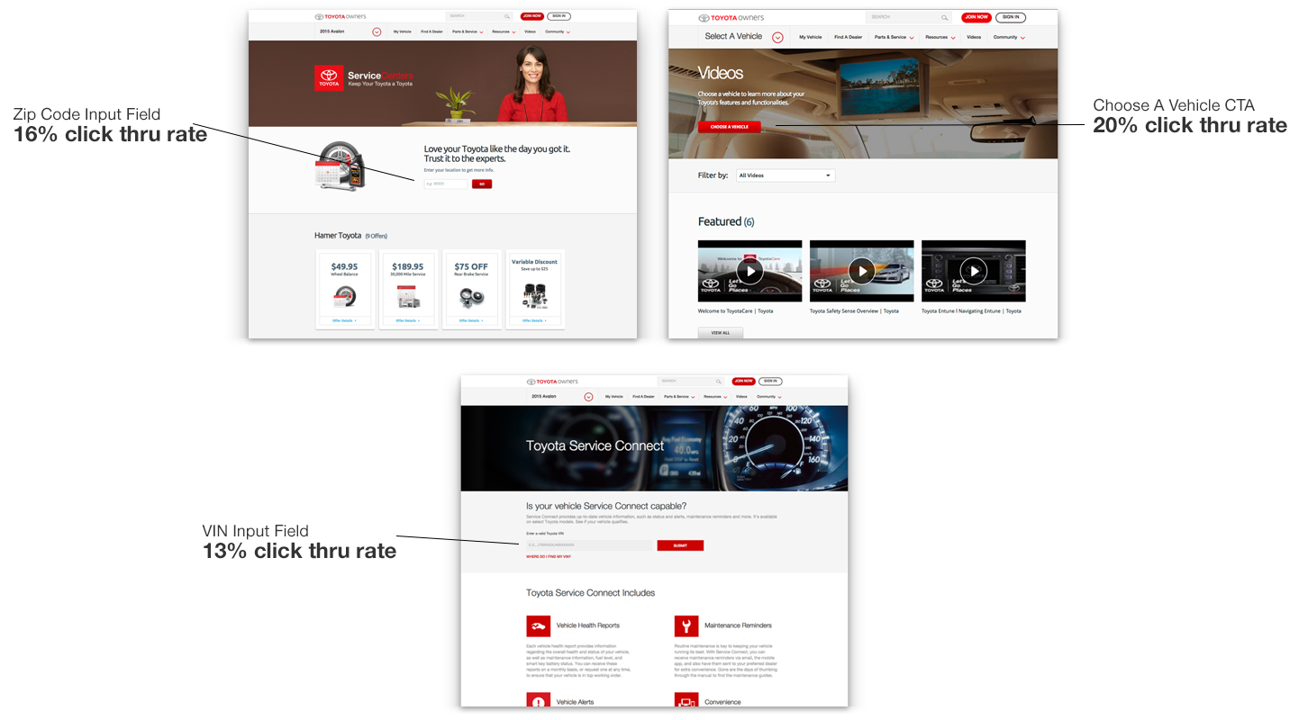
1. Zip Input Field
Analytics
Before Redesign: 16% CTR (Click thru rate)
After Redesign: 32% CTR
Analytics reveal that the redesign was impactful and resulted in doubling the engagement rate.
Other pages that use this masthead paradigm include
• Find A Dealer
• Toyota Express Maintenance
• Service Offers
2. Select A Vehicle CTA
Analytics
Before Redesign: 20% CTR
After Redesign: 39.5% CTR
Analytics reveal that the redesign was impactful and resulted in doubling the engagement rate.
Other pages that use this masthead paradigm include
• Dashboard Indicators
• Manuals & Warranty
3. VIN Input Field
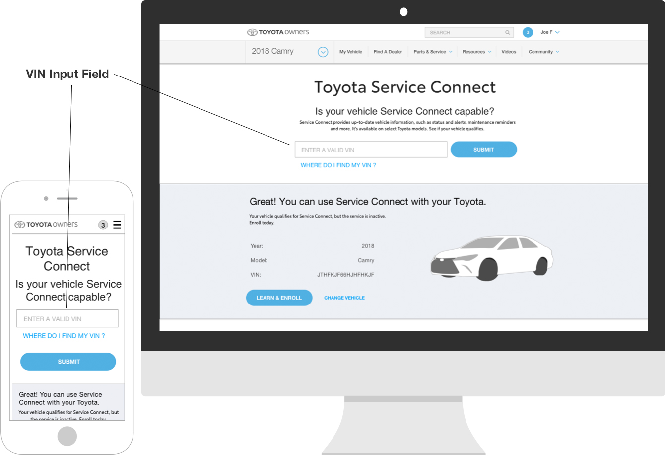
Analytics
Before Redesign: 13% CTR
After Redesign: 29% CTR
Analytics reveal that the redesign was impactful and resulted in an engagement rate increase of 123%.
Other pages that use this masthead paradigm include
• ToyotaCare
• Vehicle Specification
• Service History
Visual Design
The visual comps reveal that the redesigns have been drastically simplified from the originals. Analytics reveal that this UX direction has helped users focus on important user tasks, leading to significant increases in engagement.