Role
As the UX designer on the project, I was tasked with auditing the existing experience and formulating solutions that would improve user engagement, product discoverability, and navigation. The team made use of analytics and card sorting to develop the site hierarchy.
Collaborators
Strategist
Analytics
Visual Designer
Copy Writer
Producer
Account
Developers
Part I. The Vehicle Selector
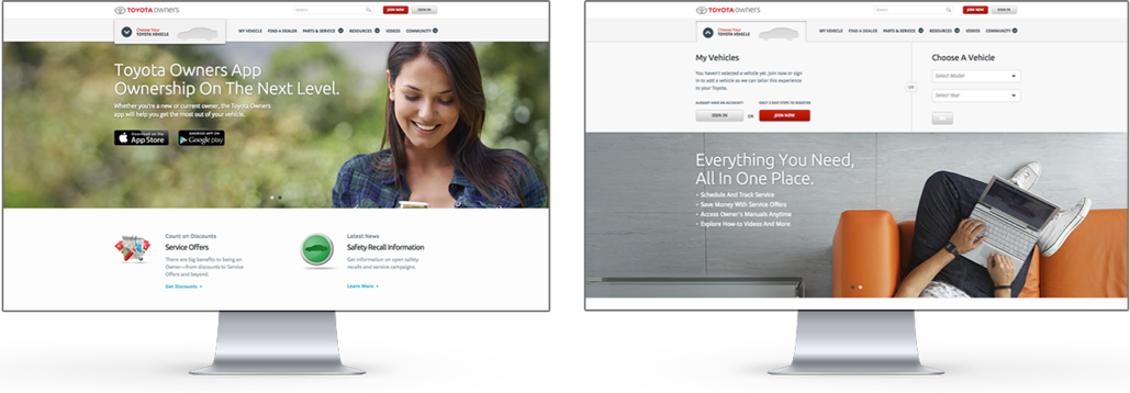
The Toyota Owners website delivers a highly personalized experience with the more information you provide it about yourself and your vehicle. The first agent that facilitates personalization is the navigation vehicle selector. Upon selecting your vehicle model and year, the contents of almost every page in Owners will filter (globally) by the chosen vehicle.
Challenge
Analytics revealed the vehicle selector had low engagement rate, proving that the intended experience was unpromising. By filtering page content according to the owner’s vehicle, users take the first step in maximizing the effectiveness of Owners as a personal resource. The low engagement also implies that users lack comprehension for the fundamentals of the Owners platform. The client requested a design update that would both increase engagement and educate newcomers about personalization.
Process
I began identifying paradigms that would achieve the following goals:
1. Promote engagement — Focus the user’s attention on the vehicle selector
2. Educate users — The vehicle selector’s purpose is to personalize page content
Logged out state — I explored existing conventions and decided the automatic rollout micro-interaction would be effective at engaging site users. When users arrive at the website for the first time, the menu would automatically rollout to grab their attention. The animation would hint that this is the suggested first action.
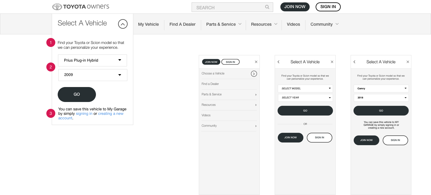
- The copy atop the model and year selection fields succinctly explains the purpose of vehicle selection.
- Model and year selection fields are shown in selected state.
- Message that explains to users the benefits of saving their vehicle to their account promotes registration. This message appears only after the user has selected the vehicle model and year — making use of progressive disclosure to simplify the initial experience.
The downside to the experience is we had to limit the automatic rollout interaction to desktop platform only. In mobile, automatically displaying the vehicle selection may confuse users — a full-screen menu takeover on launch will make them feel lost.
Nonetheless, the analytics team did mention that the engagement for the vehicle selector dropdown doubled.
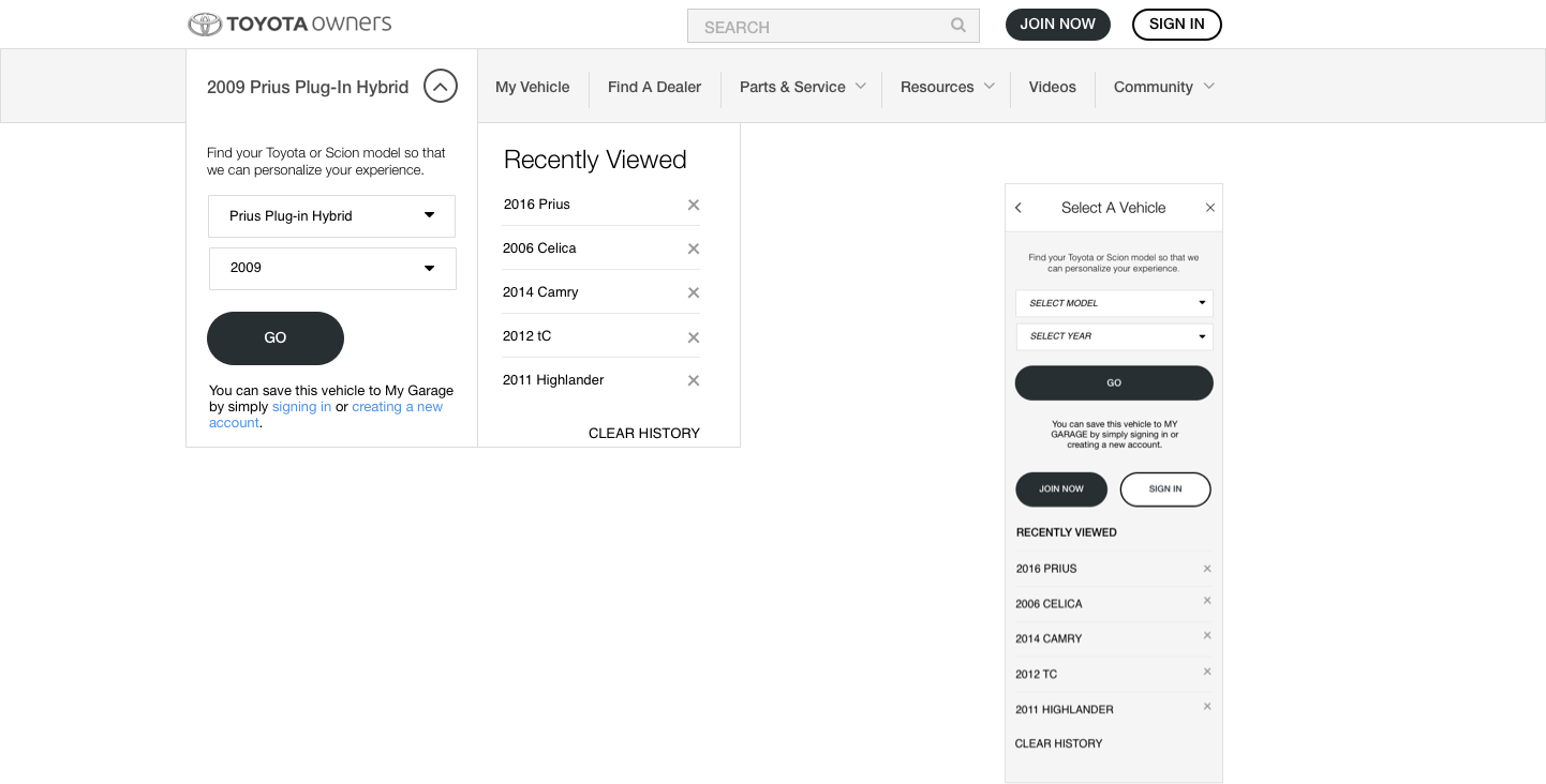
After showing the initial designs to our client, they wanted an easier way to recall previously selected vehicles. We created a history of your most recently selected 5 vehicles.
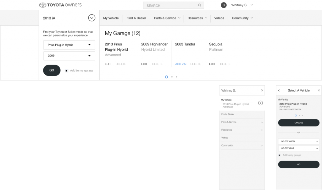
Logged in state — The logged in state reveals the ability to save vehicles and a garage of previously saved vehicles. This is a great way for users to access vehicles that were added by a 17-digit vehicle identification number (VIN). Some Toyota Owners services require the 17-digit VIN and the ability to save it to user accounts have proved to be a real time saver.
Part II. Information Architecture
Challenge
The second part of the navigation redesign focused on the information architecture of the menu, and ultimately the entire sitemap. This was a global Owners platform effort to restructure the site hierarchy. It was critical that we developed a system that is both intuitive and scalable. A good system will make discovering and navigating through multi-level content flows a painless endeavor. Another user objective was to promote clarity for the menu choices and lessen confusion. We had the following goals in mind:
- Simplify the menu choices
- Provide context to guide users to their intended destination
- Improve user engagement
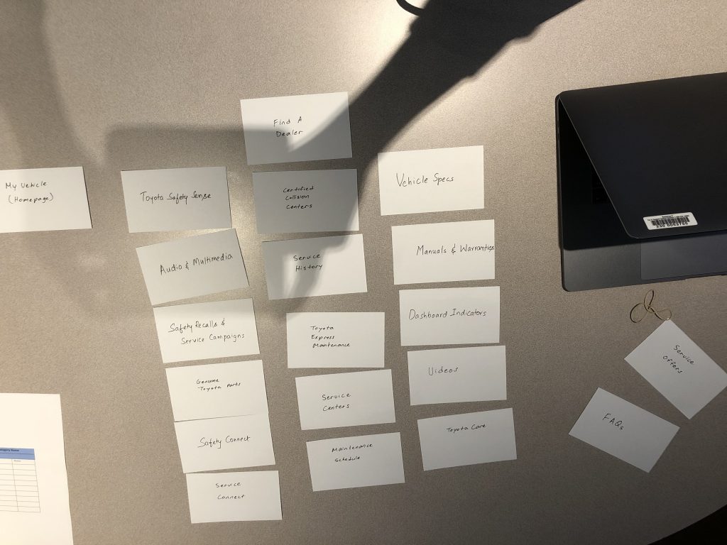
Existing navigation structure prior to redesign shown:
Discovery
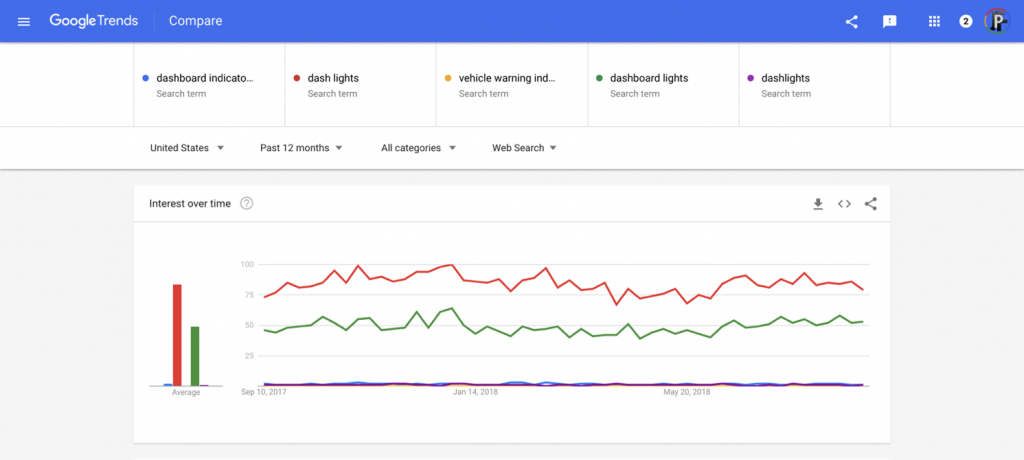
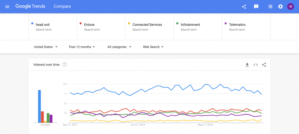
Google Trends — We looked at Google Trends and looked up ambiguous nomenclature used on our site. We compare our nomenclature with synonyms to identify the more frequently searched terms.
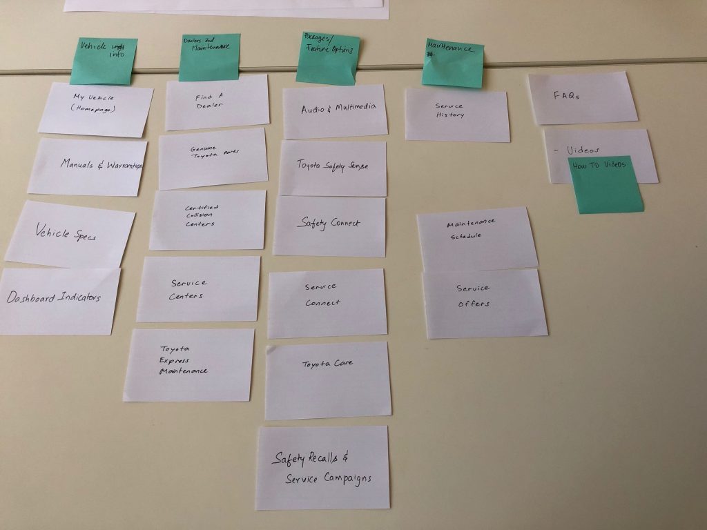
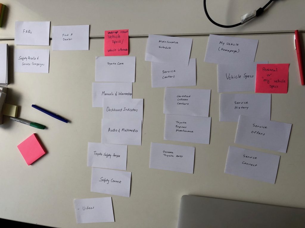
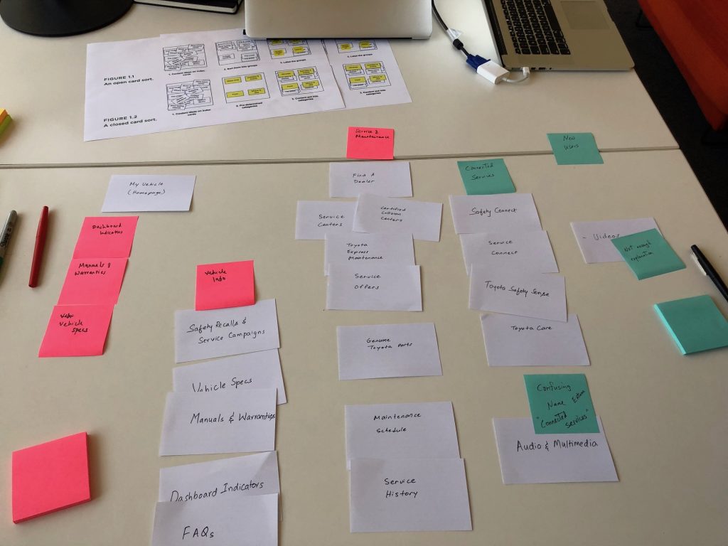
Card sorting — We conducted a card sorting study to identify patterns in user groupings. Speaking with the participants helped us gain an understanding of their mental model.
Process
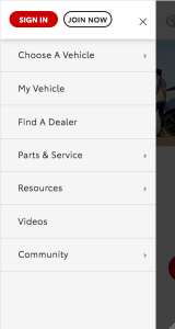
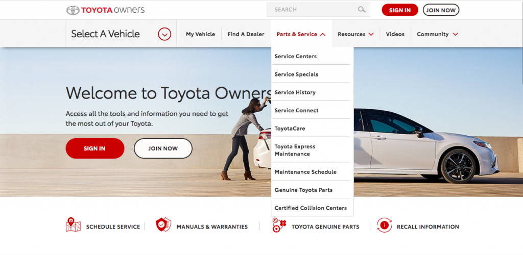
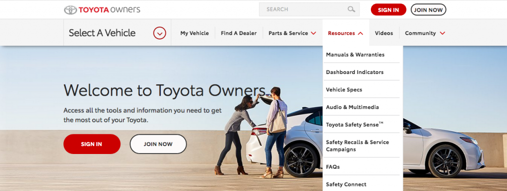
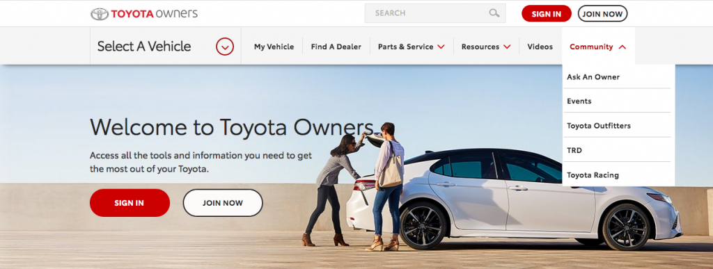
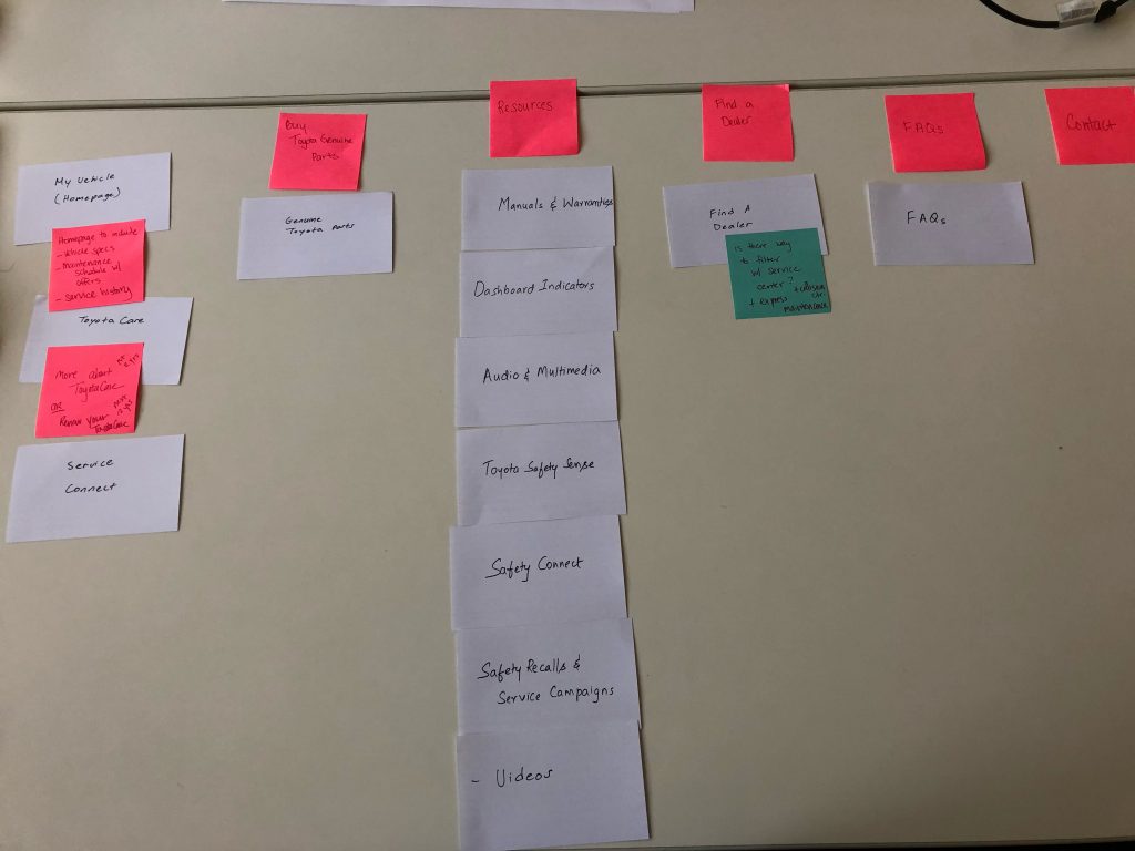
Analytics and New Categories — The team made use of analytics and business priorities to identify the order of the new navigation categories. We also identified 3 dropdowns to consolidate all the CTA’s — My Vehicle, Parts & Service, and Resources. The simplified navigation structure gives users more obvious menu choices.
The card sorting study revealed patterns where users would often cluster certain pages together. This helped inform groupings of pages within each dropdown.
The menu order is as follows with corresponding CTR’s shown:
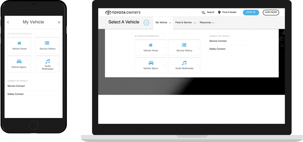
My Vehicle — house pages that generate personalized information pertaining to an owner’s specific vehicle or set of vehicles.
- My vehicle page — 135K
- Service History — 29K
- Vehicle Specs — 65K
- Audio Multimedia — 19K
- Connected Services — 3.3K
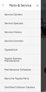
Parts & Services — house pages that provide information for finding and scheduling service, information on extended service coverage, and shopping for Genuine Toyota Parts and Accessories.
- Service Centers — 123K
- Service Specials — 77K
- ToyotaCare — 29K
- Toyota Genuine Parts — 63K
- Maintenance Schedule — No data
- Accessories — New item
- Toyota Express Maintenance — 16K
- Certified Collision Center — 3K
- ToyotaCare Plus — No data
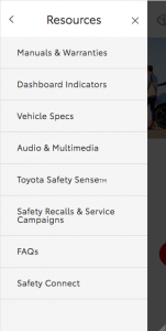
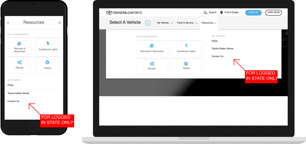
Resources — house pages that provide valuable information pertaining to Toyota vehicles across the lineup.
- Manuals & Warranties — 246K
- Dashboard Lights — 128K
- Safety Recalls & Service Campaigns — 3.5K
- Videos — 2.2K
- FAQs — 5.4K
- Toyota Safety Sense — 4K
- Contact Us — No data
Some lower engaged links are still placed higher based on business priorities. For example, ToyotaCare (no-cost maintenance plan) sits above Toyota Genuine Parts, because it’s a business priority to inform customers of the complimentary service.
Wireframes
Find A Dealer found a higher position next to the search CTA (desktop) and on the nav bar (mobile). The 3 top level categories were laid out as shown below.
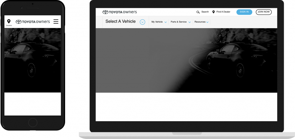
The team noticed that a majority of user engagement is captured in the top 4 links. They also wanted to mirror the navigation UI of Toyota.com, the primary marketing experience. We used 4 large icons to represent the top 4 in each category. Contextual sub-headers were used to classify link clusters — hinting at the content for each.

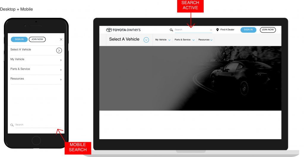
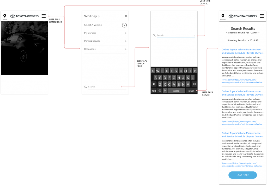
Mobile search — I noticed the Owners search field had significant user engagement on desktop (~7% user engagement, enough to place it in the top 25 of most engaged features). However, the functionality wasn’t available on mobile. We integrated mobile search in this iteration.
Results
After the new designs were implemented, the analytics team was able to provide us with data that revealed significant improvement to user engagement. With the new navigation design, analytics observed a 3% increase in engagement on desktop and 1% on mobile.
Pages that experienced double engagement or better — ToyotaCare, Service History, Vehicle Specs, Audio & Multimedia, and Vehicle Home.
Future consideration — Maintenance Schedule experiences higher engagement than many of the top 4 tile CTAs in its category as a mere text link. It might be worthwhile to consider promoting this link to the top 4.
Visit the current Toyota Owners website to see the navigation.